Hemingway App 3.0 update review: A gimmick becomes a real app
Hemingway App has been around for a while, first as a web app and then as a paid desktop app that had seen one major update in its two or so years of existence. We reviewed the original desktop app as well as the 2.0 update, concluding in the first case that it may not be worth the cost and that the update had too many compromises to go along with its price hike. How about the newest version? The price is still on the higher end of plain-text writing apps, but new features and improvements make it worth considering.
We clearly don’t have great timing here at GTT. It was only about two weeks ago that we finally got around to our review of Hemingway App 2.0. To make up for that, we’re getting this 3.0 review out quickly, just 3 days after it was announced to the public.
Overview
The creators of Hemingway—who work on it more as a side gig—say that this update involved rewriting the app entirely. This does risk stability issues, especially when they have not shown a propensity to issue bugfix updates. With that said, it’s probably a risk worth taking when you consider how limited the former versions were.
Let’s look at a rundown of the new features:
- Publish to WordPress and Medium from the app
- Export to PDF, with or without Hemingway’s highlights
- Distraction free mode with and without highlighting
- Import from HTML and Markdown
- Support for multiple documents being open at once (seriously, this wasn’t possible before)
- Interface tweaks
Interface
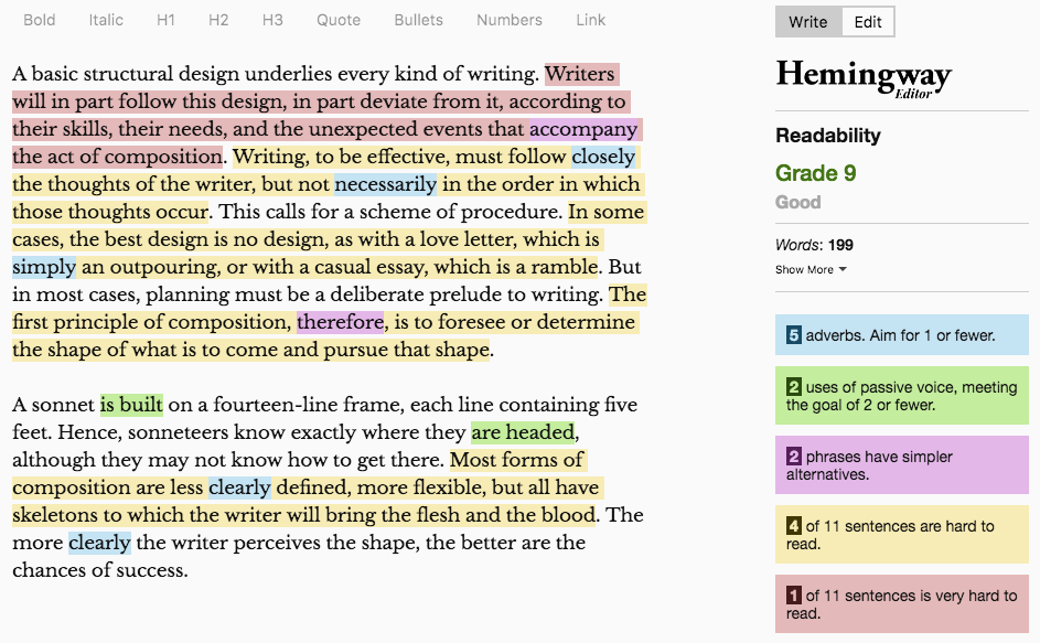
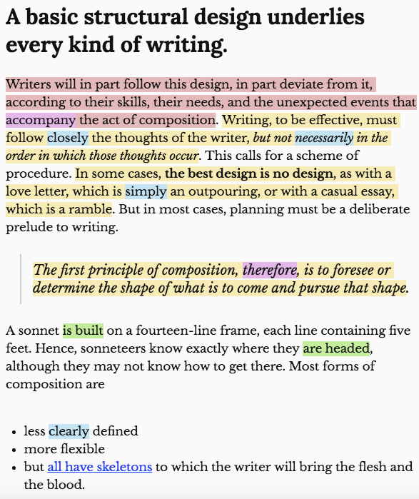
Let’s start with the bare aesthetics. Hemingway gets a minor facelift, at least at first glance. Here’s a look at it with a writing sample added:
It is simple but pleasant enough, though I should add that I am no fan of the serif font—it communicates “fancy” but designers know that serif fonts are best suited for print, not screens. For the sake of completeness, let’s have a look at the previous two versions as well.
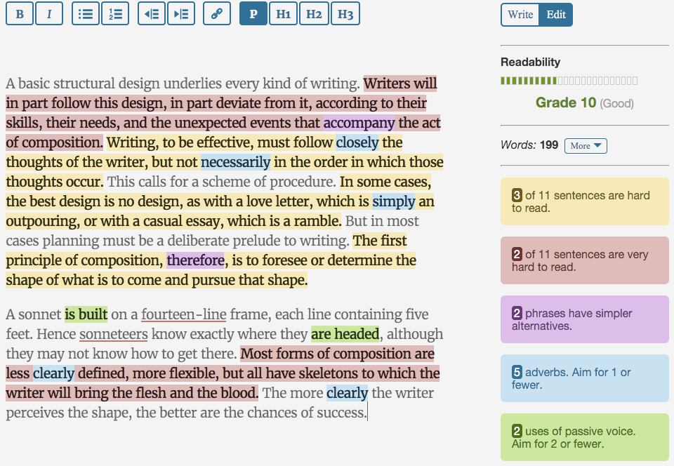
Hemingway 2.0:
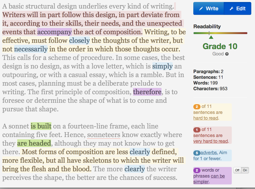
Hemingway 1.0:
I don’t think I’m out on a limb in saying that the newest edition, 3.0, looks best. Beyond that, though, there’s another aspect of the interface that deserves attention. I can’t really show it to you, but the app is much smoother in its animations and responsiveness than the earlier versions. It feels like a better-made piece of software.
It’s also worth noting that the Readability grade has changed with the same writing sample, suggesting more under the hood changes as well.
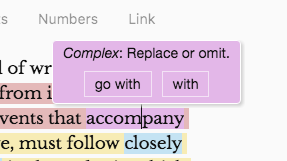
Next I want to show the tooltips that explain why things are highlighted. This has been present in some form in the previous versions, but in certain cases the tooltips are now more specific and even offer a shortcut to fix the issue with a button press.
In the above example, Hemingway is complaining that “accompany” is a needlessly complex word. It suggests using “with” or “go with” and it will replace the word “accompany” with one of those if you click one of the buttons presented. Note that you’ll have to use your brain a bit with these suggestions, since “with” would not make sense in the sentence, though “go with” would work well.
The suggestions for adverbs (as above) are less specific, since Hemingway tells you to use a different verb rather than modifying it with an adverb. On the other hand, it is often wise to do as its alternative suggests: Just get rid of the adverb and leave everything else.
PDF Export
It’s important to remember what sets Hemingway apart: The editing suggestions. That’s why, at least in the abstract, I like that this update includes the ability to export a highlighted version of the document to PDF format. This allows you to, for instance, share the suggestions with a collaborator who doesn’t have Hemingway.
You can see an example of such a document by clicking here. You don’t have any control over things like the font or full-document properties, like the margins and so on. Another potential drawback is that while the highlights are there, you will need to know ahead of time what they mean—there is no explanation embedded within.
I still think it is a good new feature, but I would like to see more options added in the future.
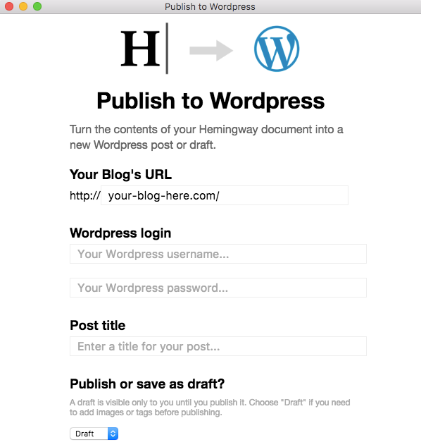
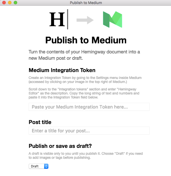
Publish to WordPress, Medium
As a disclaimer, I cannot test this easily but I felt it was worthwhile to show you how this works. It appears that Hemingway is using the same API that several other apps with this functionality use to publish to WordPress.
Clearly, you don’t need to be a computer expert to get your writing from Hemingway to your WordPress site. It would be a good idea, though, to save it in draft format so you can make sure everything renders correctly on your site. Hemingway also doesn’t have the ability to insert images in an easy way, not to mention some of the metadata you may want to add. This can be a useful part of the workflow, but I would suggest caution in publishing straight from the app.
Publishing to Medium is very similar, but you do need to get an “integration token” first rather than entering login information. Medium posts probably lend themselves to easier publishing straight from Hemingway since multimedia is less common and users tend not to use tagging and the like as much as self-hosted WordPress sites.
Exporting to Markdown, HTML
To test the ability to export to Markdown and HTML, I wanted to have a formatted document, since that’s where Hemingway would be likely to trip up. Here is how it looks in Hemingway:
First, let’s look at the Markdown produced by the export function.
# A basic structural design underlies every kind of writing.

Writers will in part follow this design, in part deviate from it, according to their skills, their needs, and the unexpected events that accompany the act of composition. Writing, to be effective, must follow closely the thoughts of the writer, _but not necessarily in the order in which those thoughts occur_. This calls for a scheme of procedure. In some cases, **the best design is no design**, as with a love letter, which is simply an outpouring, or with a casual essay, which is a ramble. But in most cases, planning must be a deliberate prelude to writing.

> The first principle of composition, therefore, is to foresee or determine the shape of what is to come and pursue that shape.

A sonnet is built on a fourteen-line frame, each line containing five feet. Hence, sonneteers know exactly where they are headed, although they may not know how to get there. Most forms of composition are

*   less clearly defined

*   more flexible

*   but [all have skeletons](gettingthingstech.com) to which the writer will bring the flesh and the blood.

The more clearly the writer perceives the shape, the better are the chances of success.
That appears perfect and renders correctly on this site if I paste it into a post.
Let’s check the HTML:
<html><head></head><body><h1>A basic structural design underlies every kind of writing. </h1>
<p>Writers will in part follow this design, in part deviate from it, according to their skills, their needs, and the unexpected events that accompany the act of composition. Writing, to be effective, must follow closely the thoughts of the writer, <em>but not necessarily in the order in which those thoughts occur</em>. This calls for a scheme of procedure. In some cases, <strong>the best design is no design</strong>, as with a love letter, which is simply an outpouring, or with a casual essay, which is a ramble. But in most cases, planning must be a deliberate prelude to writing. </p>
<blockquote>The first principle of composition, therefore, is to foresee or determine the shape of what is to come and pursue that shape.</blockquote>
<p>A sonnet is built on a fourteen-line frame, each line containing five feet. Hence, sonneteers know exactly where they are headed, although they may not know how to get there. Most forms of composition are</p>
<p> </p>
<ul>
<li>less clearly defined </li>
<li>more flexible</li>
<li>but <a href="gettingthingstech.com">all have skeletons</a> to which the writer will bring the flesh and the blood. </li>
</ul>
<p>The more clearly the writer perceives the shape, the better are the chances of success.</p></body></html>
There are a couple of extraneous , but that is pretty typical of any text-to-HTML converter, like WordPress’s visual editor. Otherwise, this is correct.
Final thoughts
This is a much more polished app than the previous iterations. For some, this will push them over the top in terms of deciding to buy it. Make no mistake, though, if you buy it, get it for the editing suggestions. Even with improvements, it is still far behind other prose-focused text editors in every other regard.
Is $20 too much? I don’t think I’d buy it today at that price, especially when I know I can paste text into the free web app to get the editing suggestions. For others of you, the $20 will feel worth it—either because you value the editing suggestions and new features so much or because $20 doesn’t feel like much money for software.
Learn more or buy it here.
COMMENTS
Search
Related Posts
Recent Posts
- Make Prism.js show line numbers by default (without CSS classes)
- Hemingway App 3.0 update review: A gimmick becomes a real app
- Hugo vs. WordPress page load speed comparison: Hugo leaves WordPress in its dust
- Hemingway App 2.0 update: A worthwhile update comes with unfortunate price hike
- How to view academic journal articles off campus using your library's proxy
categories
Support This Site
Bitcoin Donations:18DP9TGdPN5usTKMRMfPk6Q2mSr4mAz8NJLitecoin Donations:
LPKQbDPykwjXr5NbXfVVQH9TqM5C497A16
